For my ancillary tasks I had to make my own horror poster. I have studied the conventions of successful horror poster and tried to use this for my own.
Friday, 22 January 2016
Horror Poster for my trailer
For my ancillary tasks I had to make my own horror poster. I have studied the conventions of successful horror poster and tried to use this for my own.
Sunday, 17 January 2016
Monday, 4 January 2016
Character profiling
The actor below will be playing as the protagonist who will be involved in most of my trailer. This is the character that will get haunted in his dreams and will try and figure out on what to do.

This actor is the protagonists brother. He is the first person to suspect that something is up with the protagonist and sees writing on the back of the neck. But as a normal older brother he does not think much of the consequences that may occur
This is the villain of my trailer. I have added a mask to add fear to the audience. This character only appears in the protagonists dreams and does to speak throughout the trailer.
Thursday, 24 December 2015
Horror film poster analysis
Typography
The main focal point of the front cover is the bold
masthead. The typography of the masthead (insidious chapter 2) is in white and black.
This makes the mast head stand out to the audience as it is really obvious and noticeable
especially against the black background for the audience. The colour red connotes
blood and danger and the colour white refers with ghosts which signifies with what
happens during the movie and the director has done this on purpose because of
this exact reason. The colour scheme of the background is black which again
connotes danger, darkens and evilness; and again this meets with the genre of
the film. The number 2 is the biggest part of the masthead because this is
showing this is the chapter 2 of insidious and it is even bigger and better
than the first insidious.
Tagline
The tagline “It will take what you love most” delivers a
slight chill to the audience as they instantly think something bad is going to
happen to that family which is in the photo. The word “it” connotes that the
thing that is going to take who they love most in some sort of creature. However
other than that the tagline is not giving everything away which makes the
audience want to watch the movie to see what happens. The image relates well
with the tagline as the mum is holding a hammer which connotes that something
is trying to harm them in a bad way and also with them all hugging and close
together shows that they are scared of what’s going to happen to them. All of
the tagline is one syllable long which adds to the tension because it is fast
paced.
Iconography- what we expect
I would expect to see evil take some sort of form by a
creature due to where the tagline says “It”. Also I can predict that the
creature is very powerful due to the family looking timid and scared with just
a hammer for protection. Giving this is a horror film I infer than someone will
be harmed by the creature, maybe killing or seriously injured. Also the title
of the film helps us as the definition of insidious is “proceeding in a
gradual, subtle way, but with very harmful effects”. This shows that the
creature objective is to harm the family but in a very subtle way so no one
identifies that there is something wrong.
Typography
The title Friday the 13th is again in red like
insidious which again connotes danger, blood and horror. Also the title “Friday
the 13th” creates a mystery for the reader as they are wondering
what will happen on Friday the 13th. But from the main image and the
text of the writing, the audience clearly identifies that something bad is
going to happen on that specific date. The dark woods in the background adds suspense
and tension and this could infer that the danger happens in the woods as many
murders and incidents occur because the woods are a very spooky setting to hold
incidents.
Tagline
The tagline which is above the masthead says “from the
producers of the Texas chainsaw massacre”. This has been deliberately put on
the top of the masthead as the producers want to the audience to see that it is
from the same producers as the successful chainsaw massacre and this will make
it more appealing for the audience to go and watch the film.
Iconography
The knife/ sword which the man is holding are being used to
portray the villain as a serial killer and the knife itself tells the audience
that there will be murder in the film. The weapon also is an identification of
the sub-genre “slasher”. Also as I have said the woods in the background adds
tension and perhaps the main part of the film is in the woods.
Colours
As you can see the masthead is in red and as I have already
said stereotypically, the colour red associates with danger. The background is
a mixture of light and dark and the idea of Levi-Strauss binary opposite theory
of good vs evil and light vs dark is occurring in the front page. The reason why
it is light in the centre is because the focal point of the front page is the
villain and they are trying to surround the light around the villain. This could
come as a juxtaposition because when something is surrounded by light it is
usually because of something good or for example a good character but as you
can see the villain is the complete opposite to good.
Friday, 11 December 2015
Changing the setting
From House to Woods
After continuous thoughts about my
overall plot, I have changed the setting of my trailer as I feel it would be
more effective than my original idea. The original setting was to have it a
rough looking house but I feel I am unable to get the full effect of my
trailer. So the setting I have now decided is to do it in woods at night.
Before his nightmare starts his brother sports the word “RUN” on the back of
his neck, neither know why or how it got on his neck. Without thinking anything
of it he rubbed it off and went to bed.
Each nightmare will start with the
main character running in dark woods. He is unable to figure out why he is
running in every nightmare he sees a man in all black in a mask. Every time he
turns to look the unknown man is there (around 50 yards away). The last scene
will be running and then looks behind then looks in front and he is standing
right there in front of him. The plot of my film is very much the same but I
have not included the whispers and changed the setting. The writing on his body
whilst asleep has stayed as I feel this builds us the tension of the trailer
but instead of a locked up room I am instead having the main character running
in the woods and the two characters “unknown” will be appearing in different
places to frighten the audience. That is my main aim when recording the
trailer, as it is very hard to make trailers that build tension and interests
the viewer throughout.
Tuesday, 8 December 2015
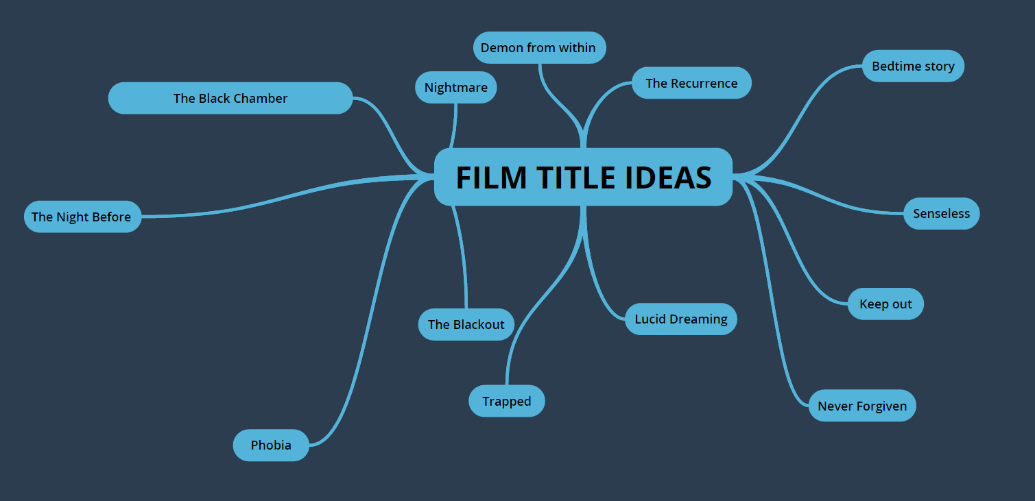
Film Title Planning
I have been struggling to find a title for my trailer so I have created a mind map on different ideas on what I could call my film.
Monday, 7 December 2015
Organising Actors
I emailed my actors in a week advance just to confirm if they will be available on the dates when I will be filming. Thankfully, each of them are available on these dates and all seem to be looking forward to be taking part. Transport to getting the destination I will be filming is no problem as two of the actors have cars so they will be able to drive to and from the venue easily. These are the 4 actors I chose because I feel that these are the most reliable actors I could get and I can ensure that they will turn up to each day of filming.
Subscribe to:
Posts (Atom)