Thursday, 24 March 2016


Wednesday, 23 March 2016
Evaluation
Evaluation
Evaluation: How effective is
the combination of your main product and ancillary texts?
When deciding
upon what genre I wanted to base our media product on, I researched many
different genre trailers. This allowed me to gain a brief understanding of the
codes and conventions of different types of trailers. From the research, I
decided to make my media product a psychological horror. I felt horror was the
easiest genre to portray in our media product as the props which I wanted Ire
easily assessable and the codes and conventions that I researched I found
easiest to understand and felt that I would able to fulfil these codes and
conventions.
From both of my
main product and the ancillary tasks I explored high standard movie trailers,
posters and magazines. This gave me an idea for each and helped me explore the
conventions of for my main product and ancillary tasks. I used the same image
for my poster and magazine and image was very dark and I used a large image
which was the vocal point of my ancillary tasks. After analysing some posters
and magazines I identified that they all used the horror character on the front
of the magazine and poster.
Firstly, with
the use of props. When making the trailer, magazine and the poster I included
the use of the main prop which was the mask of the character “unknown”, this is
because the mask shows the horror genre of the film and having this link with
the trailer and poster is vital as I feel I would not look as effective if the
trailer and poster Ire both suggesting different genres for my film. Colour was a big part of the trailer, poster
and magazine cover as I used two colours in all three. Black, white and red Ire
the colours I used, I did this because I wanted the colour to be iconic, this
would then mean that whenever someone’s sees the colour of red, black or white,
they could associate it with our characters. Fonts Ire also a big part of the
trailer as this helped me also keep continuity of the poster and magazine, I
used a similar font in each ancillary text and in the trailer to make sure this
continuity progressed, this then helped me make sure that each part linked with
each other. This would then mean our
audience could associate this font with my film as they would have seen it in
three different areas and this font could easily be put into their heads. Font
was also important as I had to make sure the font I chose was relevant and
suited the psychological horror.
What have you
learned from audience feedback?
Audience
feedback has been very valuable when completing my ancillary tasks. The
feedback I received from my peers helped me improve my first drafts and without
the feedback which I received, I would of have been able to produce successful
ancillary tasks that suits my target audience. It was a hard process when
producing my ancillary tasks, one reason for this was due to the fact that I
struggle to keep up with my timeline and struggled to meet deadlines. However,
I was still able to create three drafts which on each time I improved my ancillary
tasks whether it was my editing needing to improve. What did help me was as I
created a magazine in AS so I already had experience using InDesign and
Photoshop so I was able to see where I can improve from my previous year. I have asked my peers to give me feedback on
my blog on their opinion of my ancillary tasks. I also asked them to say
How did you
use media technologies in the construction and research, planning and
evaluation stages?
I used a variety
of media technologies to help conduct my research. These different technologies
range from using social networks such as Facebook and YouTube to different
editing websites such as InDesign and Photoshop.
Before I
produced my trailer, I created a survey to get opinions from a random sample to
help me of what my trailer should look like, for example the setting of my
trailer. For this I used the website survey monkey to put together 10 questions
that Ire inspired by 25 random individuals. The questions that Ire asked Ire
their age, gender and the characteristics they would like to see in a horror
movie trailer. The reason why I used this website was because it was really
quick and easy to create multiple choice questions and did not take a lot of time
in my timeline so I was able to focus on more important tasks such as producing
my trailer and my ancillary tasks. The website gave me charts of each question
which told me what option was picked the most by the individuals who filled out
my questionnaire.
Tuesday, 1 March 2016
Thursday, 11 February 2016
Film trailer draft 2
This is my second draft of my horror movie trailer. I still have a lot to work to do on it with shooting more shots and making my trailer more realistic which meet the codes and conventions of a movie trailer. From my first draft I have added music which I believe makes the trailer more tense and dramatic.
Friday, 5 February 2016
Film trailer draft 1
This is my first draft for my horror movie trailer. I have tried to meet the codes and conventions of a high profiled movie trailer. However, what is vitally important is to add music to my trailer as without music it is very bored and timid. Having music in your trailer creates suspense and tension to the trailer which I will need to add before the deadline.
Wednesday, 27 January 2016
Horror Magazine for horror trailer
This is my second ancillary task where I have completed a magazine. I have used the same edited image as I used for my poster as I feel it is a very effective photo and completes the codes and conventions of a horror magazine.

Friday, 22 January 2016
Horror Poster for my trailer
For my ancillary tasks I had to make my own horror poster. I have studied the conventions of successful horror poster and tried to use this for my own.

Sunday, 17 January 2016
Monday, 4 January 2016
Character profiling
The actor below will be playing as the protagonist who will be involved in most of my trailer. This is the character that will get haunted in his dreams and will try and figure out on what to do.

This actor is the protagonists brother. He is the first person to suspect that something is up with the protagonist and sees writing on the back of the neck. But as a normal older brother he does not think much of the consequences that may occur

This is the villain of my trailer. I have added a mask to add fear to the audience. This character only appears in the protagonists dreams and does to speak throughout the trailer.

Thursday, 24 December 2015
Horror film poster analysis

Typography
The main focal point of the front cover is the bold
masthead. The typography of the masthead (insidious chapter 2) is in white and black.
This makes the mast head stand out to the audience as it is really obvious and noticeable
especially against the black background for the audience. The colour red connotes
blood and danger and the colour white refers with ghosts which signifies with what
happens during the movie and the director has done this on purpose because of
this exact reason. The colour scheme of the background is black which again
connotes danger, darkens and evilness; and again this meets with the genre of
the film. The number 2 is the biggest part of the masthead because this is
showing this is the chapter 2 of insidious and it is even bigger and better
than the first insidious.
Tagline
The tagline “It will take what you love most” delivers a
slight chill to the audience as they instantly think something bad is going to
happen to that family which is in the photo. The word “it” connotes that the
thing that is going to take who they love most in some sort of creature. However
other than that the tagline is not giving everything away which makes the
audience want to watch the movie to see what happens. The image relates well
with the tagline as the mum is holding a hammer which connotes that something
is trying to harm them in a bad way and also with them all hugging and close
together shows that they are scared of what’s going to happen to them. All of
the tagline is one syllable long which adds to the tension because it is fast
paced.
Iconography- what we expect
I would expect to see evil take some sort of form by a
creature due to where the tagline says “It”. Also I can predict that the
creature is very powerful due to the family looking timid and scared with just
a hammer for protection. Giving this is a horror film I infer than someone will
be harmed by the creature, maybe killing or seriously injured. Also the title
of the film helps us as the definition of insidious is “proceeding in a
gradual, subtle way, but with very harmful effects”. This shows that the
creature objective is to harm the family but in a very subtle way so no one
identifies that there is something wrong.

Typography
The title Friday the 13th is again in red like
insidious which again connotes danger, blood and horror. Also the title “Friday
the 13th” creates a mystery for the reader as they are wondering
what will happen on Friday the 13th. But from the main image and the
text of the writing, the audience clearly identifies that something bad is
going to happen on that specific date. The dark woods in the background adds suspense
and tension and this could infer that the danger happens in the woods as many
murders and incidents occur because the woods are a very spooky setting to hold
incidents.
Tagline
The tagline which is above the masthead says “from the
producers of the Texas chainsaw massacre”. This has been deliberately put on
the top of the masthead as the producers want to the audience to see that it is
from the same producers as the successful chainsaw massacre and this will make
it more appealing for the audience to go and watch the film.
Iconography
The knife/ sword which the man is holding are being used to
portray the villain as a serial killer and the knife itself tells the audience
that there will be murder in the film. The weapon also is an identification of
the sub-genre “slasher”. Also as I have said the woods in the background adds
tension and perhaps the main part of the film is in the woods.
Colours
As you can see the masthead is in red and as I have already
said stereotypically, the colour red associates with danger. The background is
a mixture of light and dark and the idea of Levi-Strauss binary opposite theory
of good vs evil and light vs dark is occurring in the front page. The reason why
it is light in the centre is because the focal point of the front page is the
villain and they are trying to surround the light around the villain. This could
come as a juxtaposition because when something is surrounded by light it is
usually because of something good or for example a good character but as you
can see the villain is the complete opposite to good.
Friday, 11 December 2015
Changing the setting
From House to Woods
After continuous thoughts about my
overall plot, I have changed the setting of my trailer as I feel it would be
more effective than my original idea. The original setting was to have it a
rough looking house but I feel I am unable to get the full effect of my
trailer. So the setting I have now decided is to do it in woods at night.
Before his nightmare starts his brother sports the word “RUN” on the back of
his neck, neither know why or how it got on his neck. Without thinking anything
of it he rubbed it off and went to bed.
Each nightmare will start with the
main character running in dark woods. He is unable to figure out why he is
running in every nightmare he sees a man in all black in a mask. Every time he
turns to look the unknown man is there (around 50 yards away). The last scene
will be running and then looks behind then looks in front and he is standing
right there in front of him. The plot of my film is very much the same but I
have not included the whispers and changed the setting. The writing on his body
whilst asleep has stayed as I feel this builds us the tension of the trailer
but instead of a locked up room I am instead having the main character running
in the woods and the two characters “unknown” will be appearing in different
places to frighten the audience. That is my main aim when recording the
trailer, as it is very hard to make trailers that build tension and interests
the viewer throughout.
Tuesday, 8 December 2015
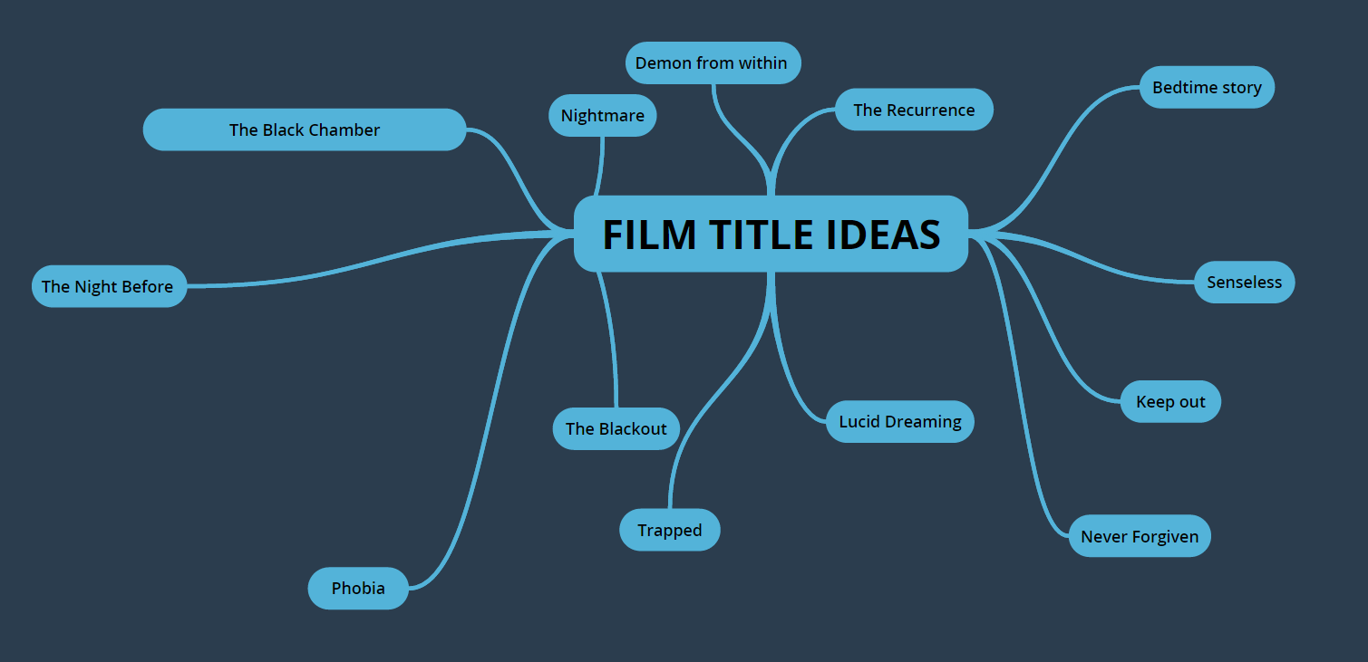
Film Title Planning
I have been struggling to find a title for my trailer so I have created a mind map on different ideas on what I could call my film.
Monday, 7 December 2015
Organising Actors
I emailed my actors in a week advance just to confirm if they will be available on the dates when I will be filming. Thankfully, each of them are available on these dates and all seem to be looking forward to be taking part. Transport to getting the destination I will be filming is no problem as two of the actors have cars so they will be able to drive to and from the venue easily. These are the 4 actors I chose because I feel that these are the most reliable actors I could get and I can ensure that they will turn up to each day of filming.
Monday, 23 November 2015
Purpose of a Movie Trailer
Purpose Of a movie Trailer
The purpose of a film trailer is to make the audience want to
watch the movie and to intrigue the individual who is watching the trailer. They
use a variety of techniques that are employed in order to tantalize to viewer. The
trailers only last around two and a half minutes which they need to sell off their
movie to excite the viewer. Trailers are advertisements directed at the
audience. Due to only being around two and a half minutes they usually consist of
selected shots from the featured film and are usually taken from the most
excting parts of the film.
The purposes of film trailers are;
- To create interest in the film
- Inform the audience of the film i.e. the genre, the
date of release and the production studio
- To persuade the audience that the film is worth seeing
- To ‘show off’ some of the main actors and stars in the
film
- To ‘tease’ the audience by creating excitement and
intrigue with the use of conventions such as narrative enigmas
- To showcase some of the best features in the film
Whether in the cinema or on TV, the
distributors think carefully about who will be watching at this time and try to
show a trailer which will be interesting to this type of audience. For example,
a trailer for Thomas and the Magic Railroad would not be shown before an 18
certificate horror film at the cinema or in the break of Coronation Street
because the distributors want as many children as possible to see it.
Monday, 16 November 2015
Storyboard of my Movie Trailer
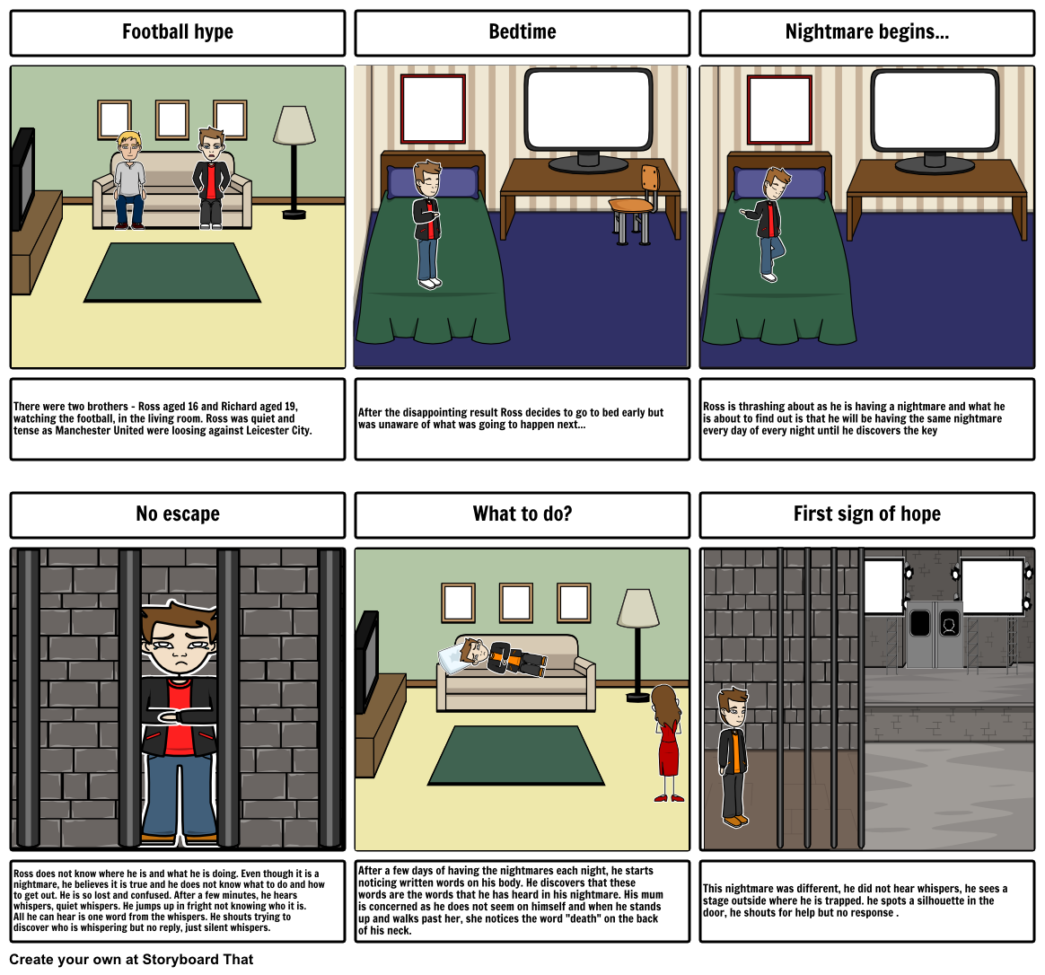
This is the storyboard that i created on the website storyboard that. This has helped me develop my ideas of my trailer and come up with good ideas to produce my film trailer. Hopefully, I can now start recording my trailer as I have now got characters to be in my trailer that I believe will be reliable and trustworthy. My trailer, is specifically based on one character where he will be involved throughout. Camera angles in my trailer will add to the tension and make my trailer look much more professional.
A use of variety of camera angles is vital for a trailer. The camera shot I will use for the when he is trapped is a birds eye view because these kinds of shots are used in many horror trailers to make the person that is being looked down on and seem completely powerless and vulnerable. Also, when he is scared and looks vulnerable, I will use many close ups to see his reactions and his expressions. This is a shot that shows the most emotion from the characters. It also is used to capture detail in a important scene. A panning shot will be used in the last shot to show that someone is looking at him and
Subscribe to:
Posts (Atom)